Solving Adoption Problem by Redesigning the Interface
Company:
Point of Reference
Team:
PM , UX Director
Role:
UX/UI Designer
Timeline:
16 weeks
Introduction:
ReferenceEdge platform is a customer relationship management B2B software service. It helps businesses identify, recruit, and manage customer advocates to improve sales & marketing efficiency through automation.
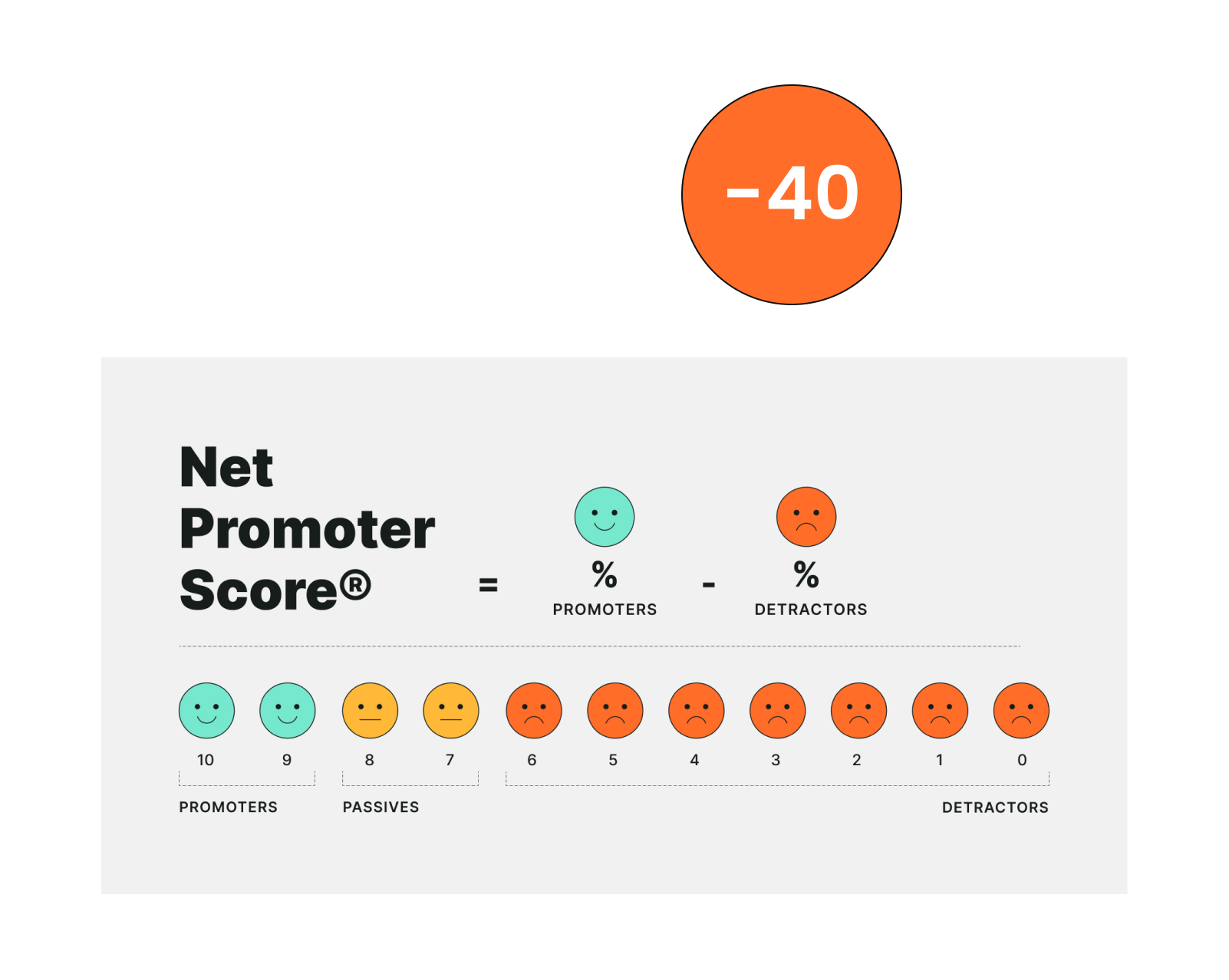
The outdated UI was confusing, inefficient, and didn’t support video calls, leading users to abandon the task. As a result, the company received a negative Net Promoter Score.
PROBLEM
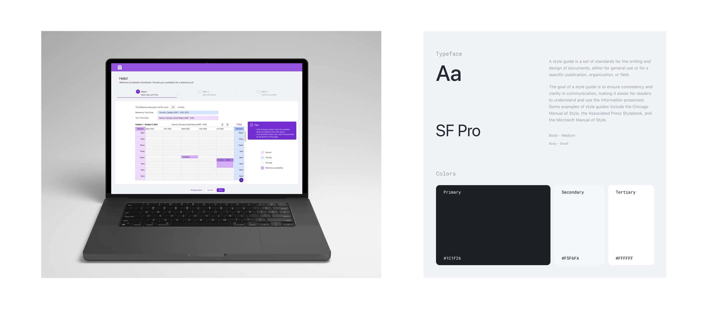
I improved the User Experience by changing the calendar view to a work week view and enabling click and drag interaction that easily allows users to select multiple options at once. Additionally, I updated the UI Style by adding a second design system and a video conference option as a communication channel.
SOLUTION
IMPACT
80% Task success rate
110 points increase in NPS
RESEARCH
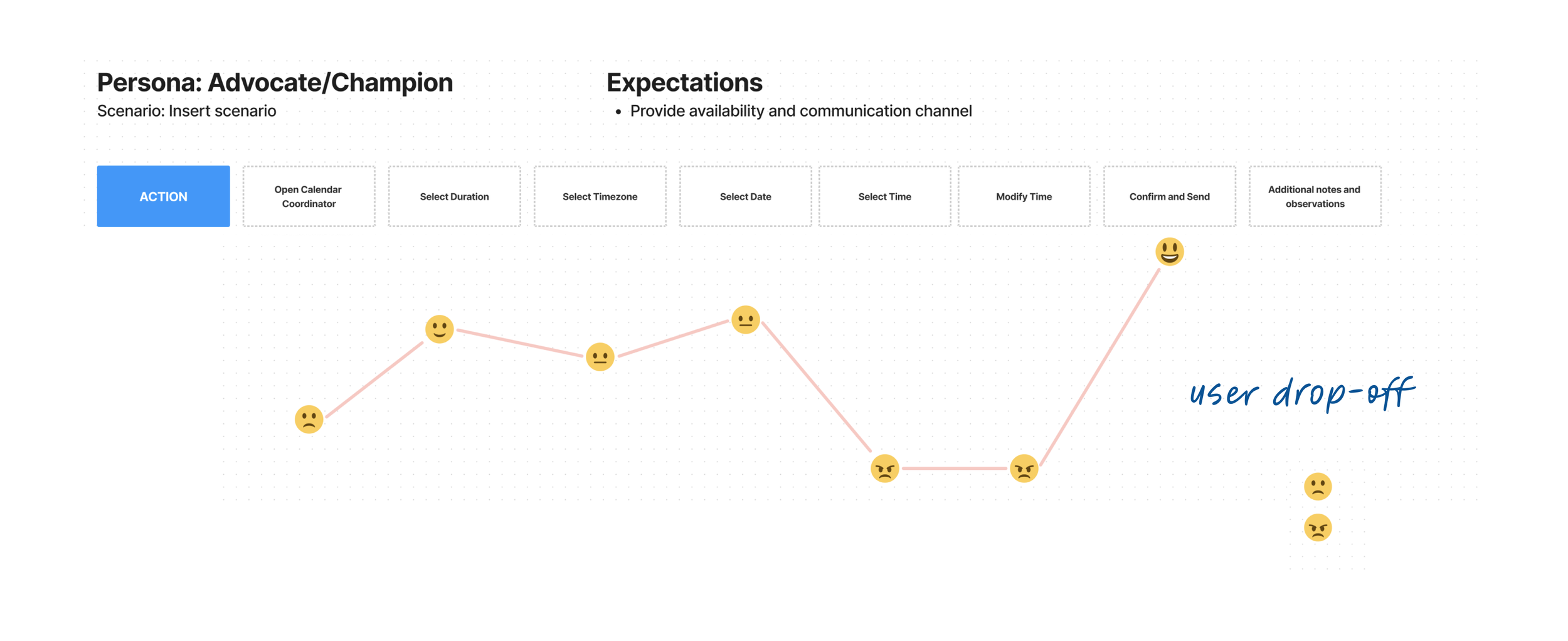
During the research, I identified 3 main personas: Account Executive, Advocate, and Prospective Buyer wich helped me better understand pain points and opportunities for improvement from the user perspective. Next, I mapped out each persona’s user journey, and performed a heuristic evaluation of the product to come up with a list of improvements for each user flow.
The users are prospective buyers and satisfied customers
Users can’t complete the task and abandon product
PROGRESS AND ITERATIONS
Solution #1
Present week view, enable click and drag
Solution #2
Allow selecting a video conference call
Solution #3
Update UI style by moving to a new design system
CHALLENGES & NEXT STEPS
The biggest challenge was to find the most intuitive way to present overlapping time zones to the user. I presented four ideas to the team, and by testing them with users, we found the most optimal one. To add more clarity, I supplemented the table with a legend and a tip on how to use the calendar view to select times. I recommended continuing to measure user satisfaction and iterate.
Measure
Task success rate
Time on task
NPS
CSAT


